Redeeming corporate gifts from your mobile device with Snackmagic
The Snackmagic AppAs part of a company-wide initiative to increase recipient redemption rates,
I spearheaded the design of the SnackMagic App for both iOS and Android platforms. This project involved conducting competitor analysis, mapping user journeys, collaborating closely with engineers, and refining the app through multiple iterations to deliver an intuitive, visually appealing, and user-friendly final experience.
roleLead Product Designer
durationproject includesResearch, Wireframing, Iterations & Final Designs
8 Weeks
Introduction
It's kind of like online shopping... but free!
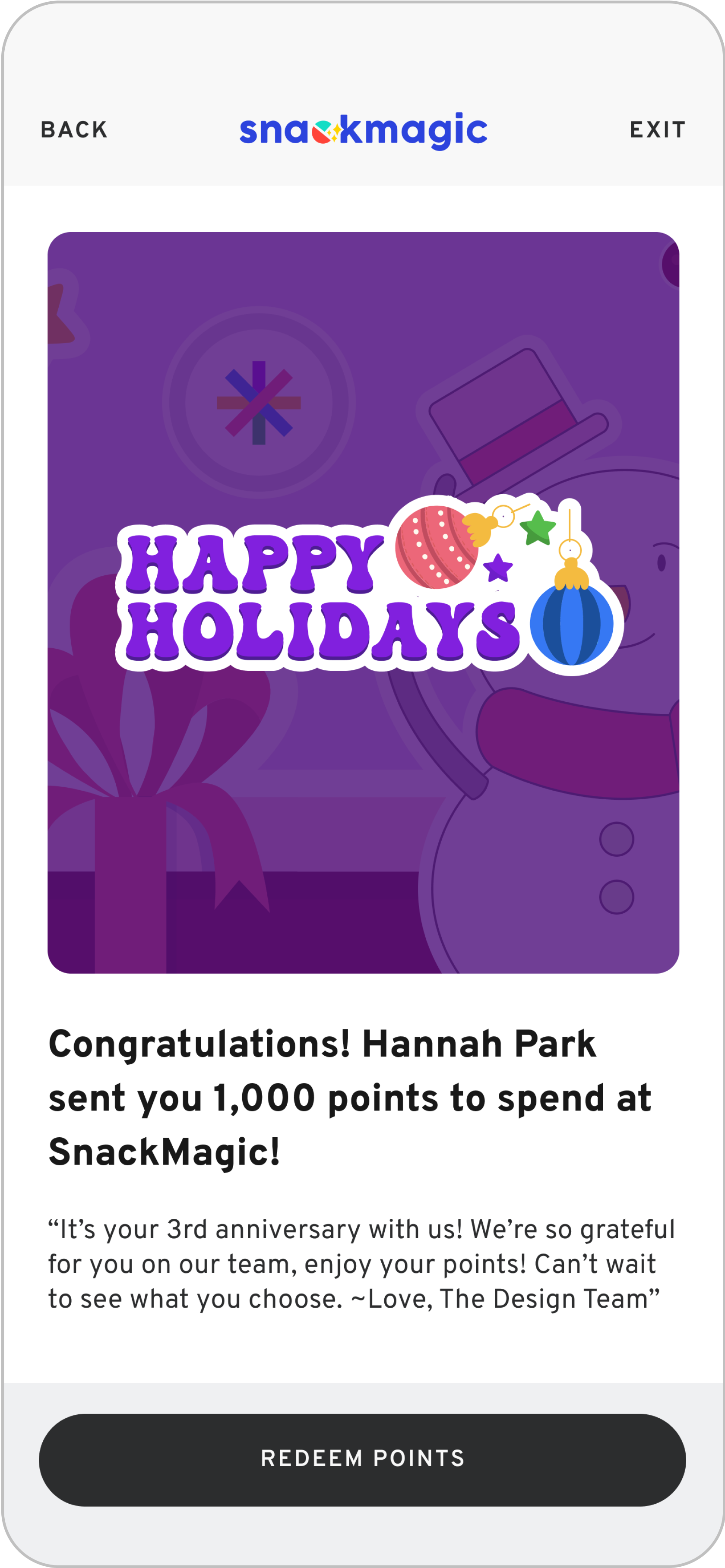
Imagine this, it's your 1st anniversary at your new job. The first email you wake up to is "Happy Anniversary, Hannah! Here's 1,000 points to spend. Treat Yourself!" Click the link, open the app, explore 1,000s of products, start adding to your cart, checkout (with the given points, so basically free) and voila! Oh no... you're late. You spent too much time scrolling on our SnackMagic App.
Creating a learnable experience involves leveraging established design patterns that users already understand. Conducting competitor analysis allowed me to explore how multiple shopping experiences are managed within a single app. I examined platforms like Instacart, Amazon, and Etsy, which excel at handling multiple carts or menus. This approach is particularly relevant for scenarios where recipients may need to redeem multiple gifts simultaneously.
Research
In designing this experience, I prioritized a mobile-first approach, going beyond simply adapting the website for smaller screens. Instead, I reimagined the experience to align with the unique constraints and opportunities of mobile devices. A key UX challenge was ensuring users could orient themselves within the app. This involved addressing critical questions: How can users quickly understand their location within the app? How can they efficiently find desired products? And how can we seamlessly guide them into the checkout flow?
UX Thinking
The initial design iterations are often high-level, featuring placeholder elements or simple grayscale layouts. As the process progresses, subsequent iterations incorporate refined design patterns and elements aligned with our design system. Later stages involve close collaboration with the engineering team to address technical constraints, team capacity, and project timelines. Iterations are finalized through rigorous testing of UAT builds on TestFlight, identifying and resolving bugs and design enhancements. Even after launch, the product remains a continuously evolving project, with ongoing improvements to refine the user experience.
Iteration
Project DefinitionThree points of view
-
SnackMagic has a proven reputation for strengthening workplace relationships by helping companies show appreciation to their employees—just ask our satisfied users. However, we identified an opportunity to enhance our redemption rate. The question is: how can we improve it?
Consider this user journey: It's your work anniversary, and the first email you see says, "Happy Anniversary, Hannah! Here's 1,000 points to spend. Treat Yourself!" You click the link, open the app, browse through thousands of products, start adding items to your cart, and proceed to checkout—all with your complimentary points, making the experience feel effortless and rewarding.
But suddenly, reality kicks in—you’re running late because you got so engrossed in exploring the SnackMagic app! -
SnackMagic positions itself as a tool for fostering relationships between employees through the act of gifting. All gifts are delivered via company email, but data shows that users often abandon the redemption process if they leave the flow at the end of the workday. Once abandoned, users are unlikely to resume.
Our analysis indicates that 49% of redemptions start directly from the initial email. Providing an entry point into a mobile app from the email offers a seamless way for users to begin the process immediately.
To minimize abandonment, our focus will be on addressing key causes of drop-off:
1. Confusion during the shopping experience
2. Lack of clarity around budget
3. An unclear redemption flow. -
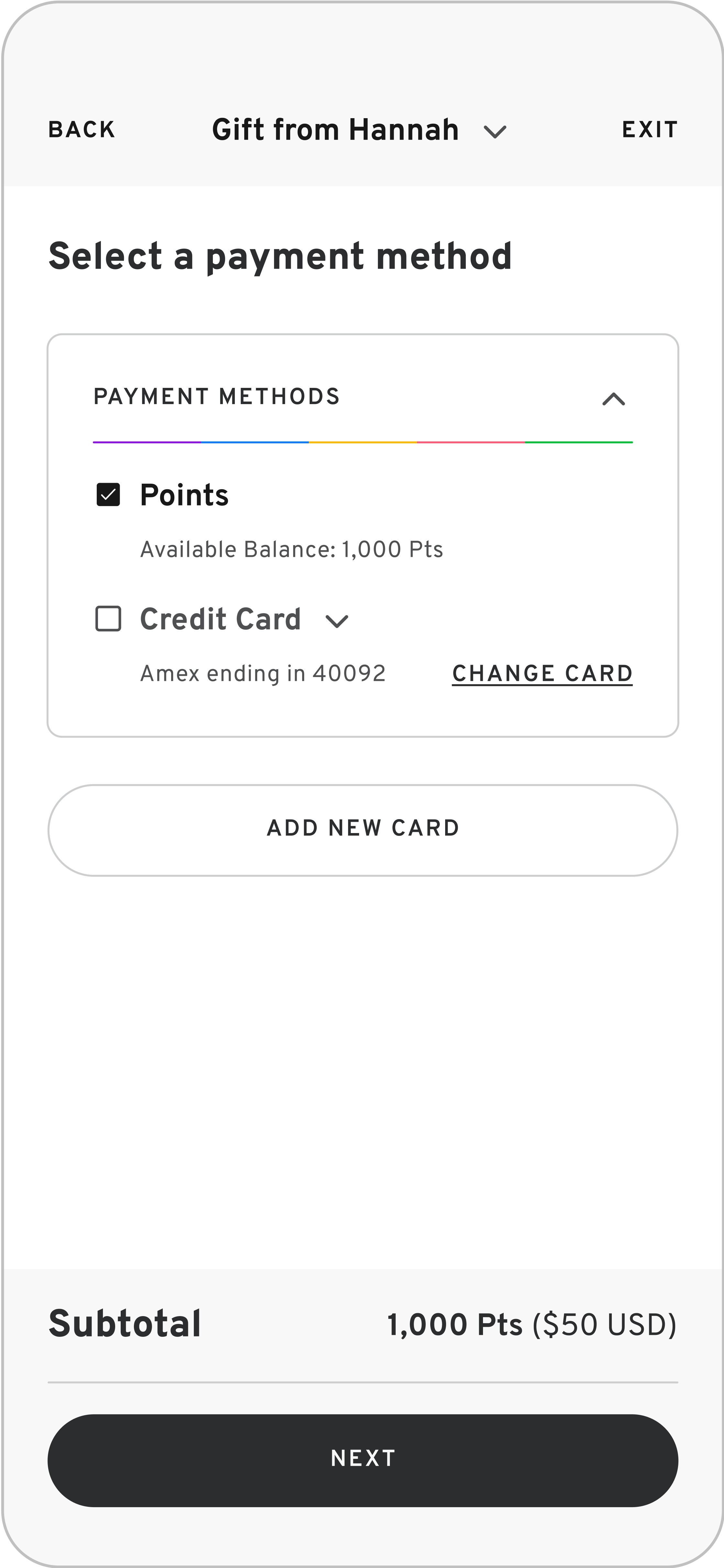
To increase the redemption rate, the focus should be on enhancing the last-mile experience—ensuring users can effortlessly add items to their cart and complete the checkout process. The goal is to make shopping on the SnackMagic app as seamless as ordering on platforms like UberEats or Instacart, enabling users to complete the process in a single flow.
This involves:
1. Simplifying navigation to make browsing items intuitive.
2. Clarifying budget details and treat categories to resolve orientation issues (e.g., understanding which menu or treat selection they are in).
3. Providing a clear, straightforward path to checkout.
AFFINITY MAPPINGOrganizing Insights
As a visual thinker, I find affinity mapping invaluable for prioritizing the key elements of a feature. This process helps clarify the needs of the design, the user, and the business. Creating charts and conducting brainstorming sessions before diving into design ensures that the broader goals remain at the forefront, preventing premature focus on fine details.
market researchCompetitive Analysis
Single Cart Across Multiple Vendors
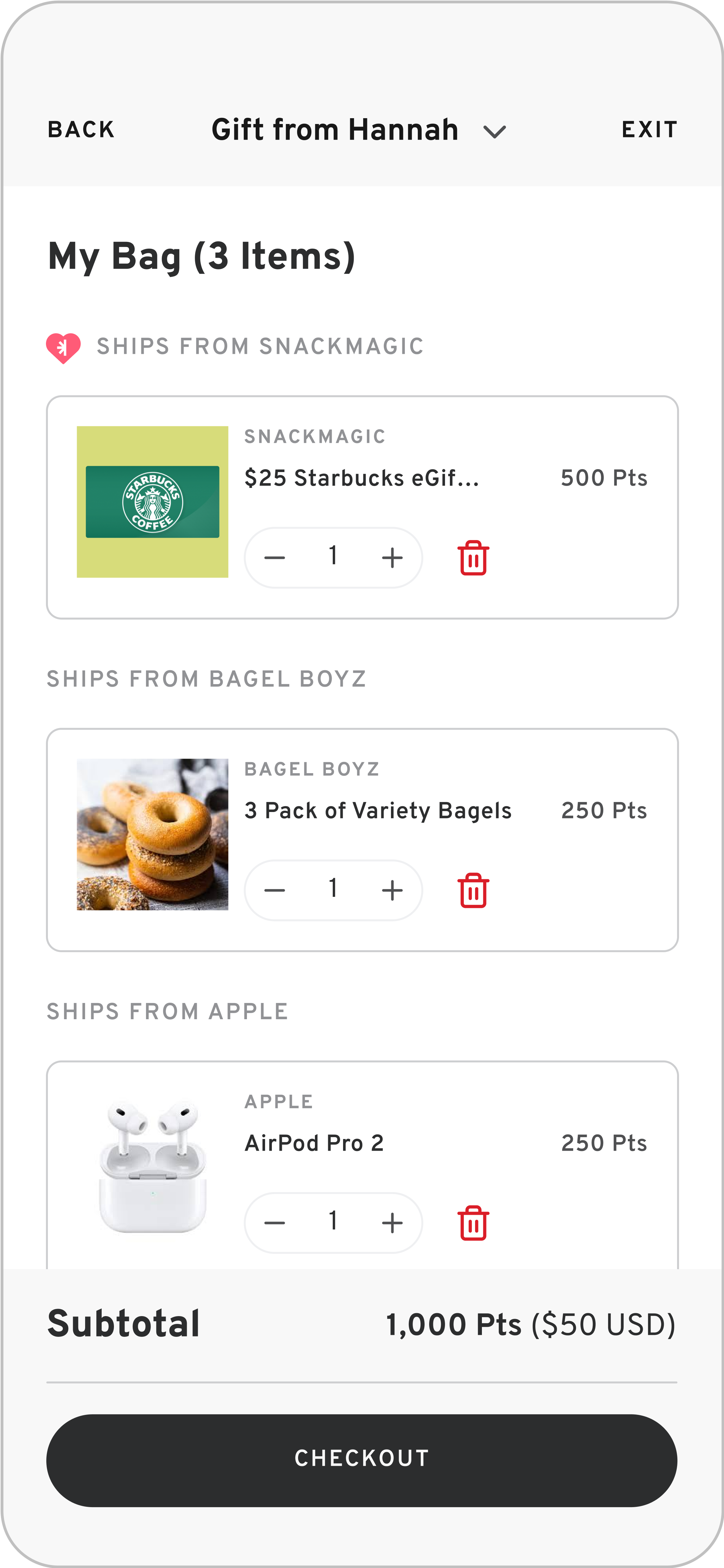
Amazon's approach of offering a unified cart for its extensive catalog of vendors inspired this design consideration. By implementing a single cart system, users can effortlessly track the items they’ve added, reducing confusion and creating a more seamless shopping experience.
Flexible Checkout Options
Etsy utilizes a single cart system but offers flexibility during checkout, allowing users to either complete purchases for individual vendors separately or process all items in the cart together.
Single Checkout Flow
Similar to SnackMagic, Instacart features multiple catalogs, resulting in multiple carts. However, Instacart addresses this by keeping carts separate while allowing users to easily navigate between them, ensuring a clear and organized shopping experience.
Wireframes
Wireframes
designing forManaging Multiple Gifts from Different Senders: Final Approach
The design process involved mapping all possible entry points for the start of the redemption flow, evaluating whether users could pause the process and resume later, and determining if they could switch between different gifts while shopping.
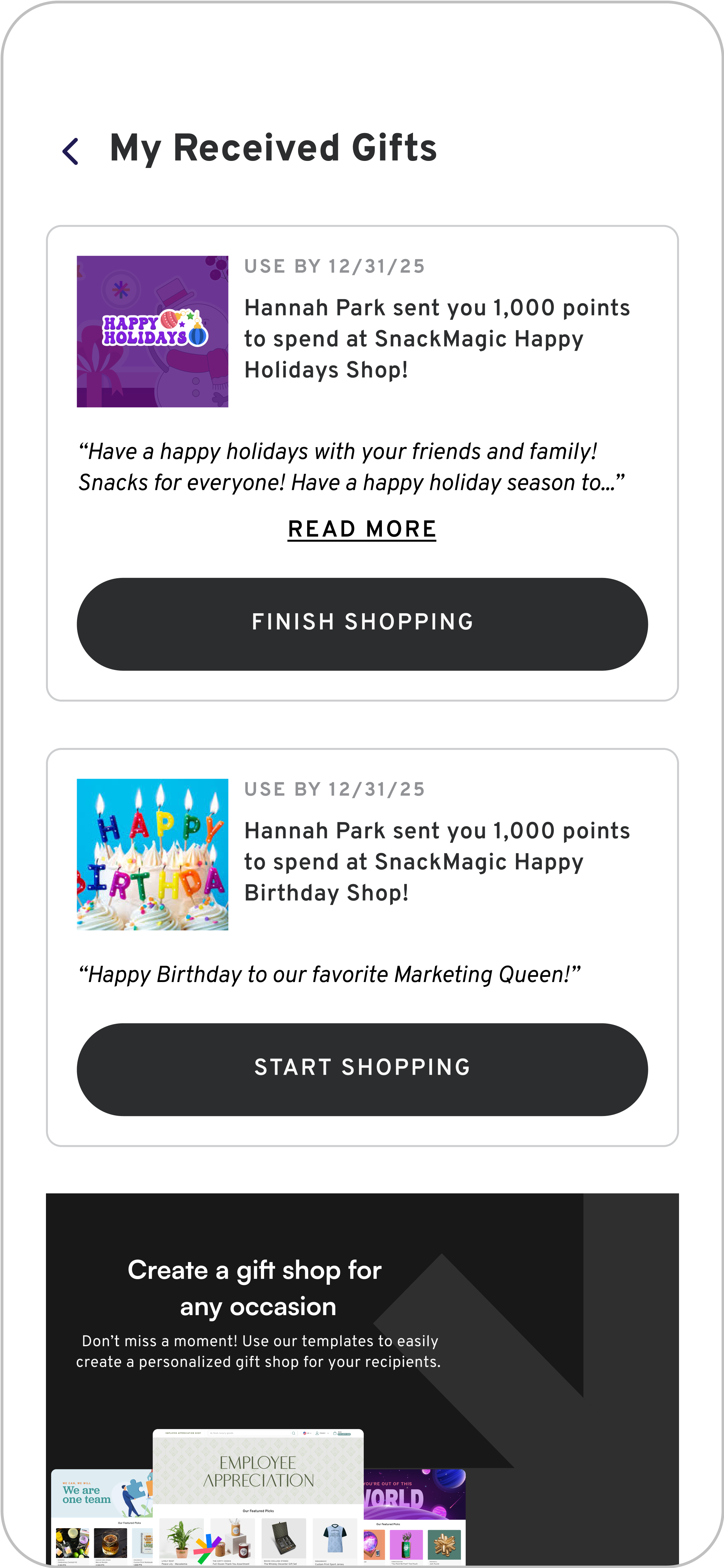
Ultimately, I chose Option #1 and Option #4. In practice, users would access the app through a link in an email, landing on a "My Gifts" list. While toggling between bags might benefit users pausing mid-experience, switching between gifts at the menu level proved more intuitive. Since users can only check out one bag at a time, we prioritized reducing potential confusion by avoiding multiple checkout CTAs. Additionally, users could completely exit one flow and seamlessly begin a new one.
Option 01
Gifts as a page where you can
begin redemption flows.
Option 02
Able to view all your gifts from
your bags screen.
Option 03
Unlike Option #2, you can see the items in each of your gift bags.
Option 04
User can switch flows without leaving the menu using a dropdown.
Thousands of Products and Gift Elements on a Small Screen
designing forDesigning for an eCommerce app is inherently complex, encompassing elements like Parent Categories, Subcategories, Product Detail screens, Add to Bag CTAs, and the Bag itself. This complexity increases when introducing an additional layer—separate menus representing different gifts. In this case, users enter a specific gift flow from the initial screen, where key information includes the gift amount and sender. This information must remain accessible throughout the shopping experience to provide clarity and context. Below are wireframes illustrating my initial approach to tackling this challenge.
Clarifying Which Gift is Being Redeemed: The top navigation bar plays a crucial role in orienting the user. It includes both a chevron and an exit icon, providing clear options for exiting the current gift flow and transitioning to another.
Ensuring a Seamless Shopping Experience While Switching Between Gifts: Users may wish to switch between gifts for various reasons, such as one gift nearing its expiration date or having a higher point balance for purchasing more items. Allowing users to switch gifts mid-shopping ensures they don’t feel as though they are "starting over," maintaining a smooth and uninterrupted experience.
high resolution screensFinal Designs
![[Open App] Splash Screen - Stadium+SM.png](https://images.squarespace-cdn.com/content/v1/673b824fff29e723225d2990/23628fe3-838c-45c6-853c-fb0cc5e1cad0/%5BOpen+App%5D+Splash+Screen+-+Stadium%2BSM.png)
![[Shops Redemption] Menu - Parent Category - All Subcategories.png](https://images.squarespace-cdn.com/content/v1/673b824fff29e723225d2990/90268354-6e79-4374-94ca-af86c5924d7b/%5BShops+Redemption%5D+Menu+-+Parent+Category+-+All+Subcategories.png)
![[Shops Redemption] Menu - Product Details - Giftcard - Default.png](https://images.squarespace-cdn.com/content/v1/673b824fff29e723225d2990/7897fc0d-3bcc-46ef-97f0-900827b4eba0/%5BShops+Redemption%5D+Menu+-+Product+Details+-+Giftcard+-+Default.png)
Taking ownership of the project
Through this experience, I significantly enhanced my user interface design skills while gaining a deeper understanding of design planning, cross-functional collaboration, and aligning features with broader company business initiatives.
The gravity of this project allowed me to refine my presentation skills, foster an inclusive environment by encouraging diverse solutions, and ensure every team member's contributions were valued. This collaborative approach resulted in a more cohesive, functional, and impactful feature while promoting team satisfaction.


